
Concept explainers
Videos
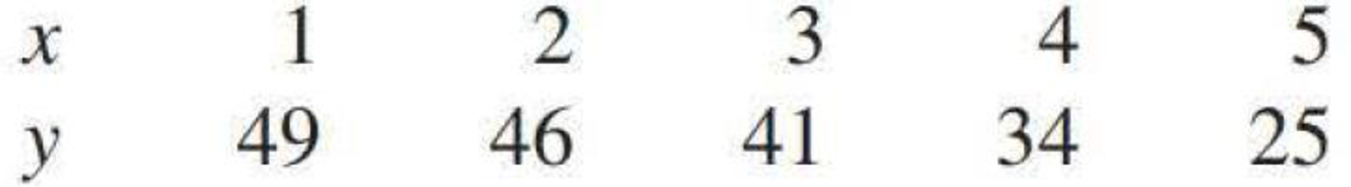
The accompanying data represent x = Amount of catalyst added to accelerate a chemical reaction and y = Reaction time:
- a. Calculate the value of the
correlation coefficient , r. Does the value of r suggest a strong linear relationship? - b. Construct a
scatterplot . From the plot, does the word linear provide the most effective description of the relationship between x and y? Explain.
a.
Find the correlation coefficient.
Explain whether the correlation coefficient suggest a strong relation or not.
Answer to Problem 68CR
The correlation coefficient is –0.981.
Explanation of Solution
Calculation:
The given data relates to the amount of catalyst added in a chemical reaction, x and the reaction time, y. The correlation coefficient is denoted by r.
Correlation coefficient:
Software procedure:
Step by step procedure to obtain the correlation coefficient using the MINITAB software:
- Choose Stat > Basic Statistics > Correlation.
- Enter the columns of x, y under Variables.
- Click OK in all dialogue boxes.
Output obtained using MINITAB is given below:
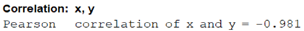
Thus, from the output, the correlation coefficient is –0.981.
Interpretation:
A value of the correlation coefficient, r closer to 1 or –1 suggests a strong correlation coefficient, whereas a value closer to 0 suggests a weak correlation coefficient.
Here, the correlation coefficient is –0.981, which is very close to –1. Evidently, the negative sign suggests a negative relationship between the variables, so that, higher values of x are associated to lower values of y.
Thus, the relationship between x and y is a very strong negative linear relationship.
b.
Draw a scatterplot of the data set.
Explain whether it is appropriate to describe the relationship between x and y as linear.
Answer to Problem 68CR
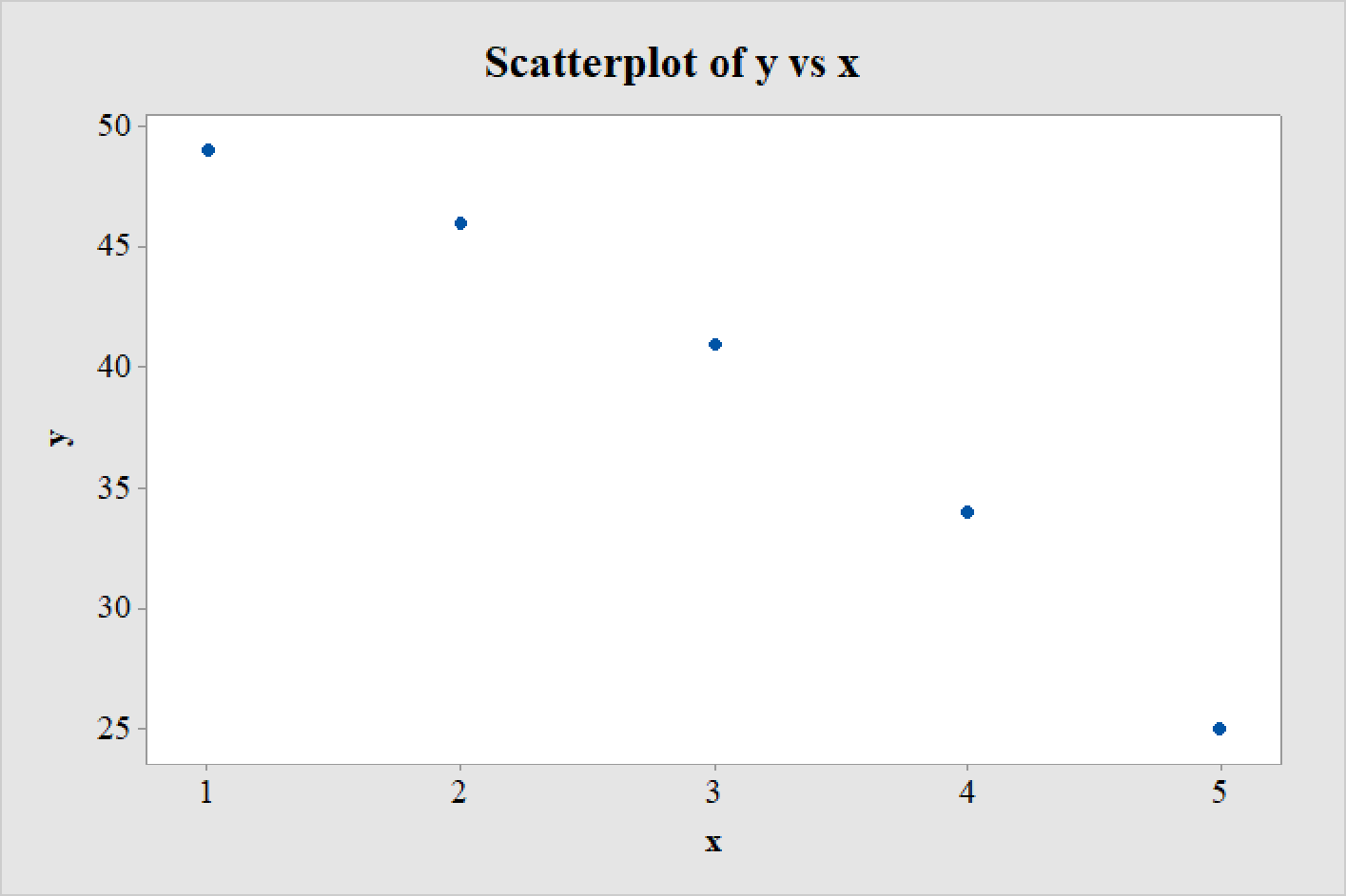
The scatterplot of the data set is as follows:
Explanation of Solution
Calculation:
Scatterplot:
Software procedure:
Step by step procedure to draw the scatterplot using the MINITAB software:
- Choose Graph > Scatterplot > Simple > OK.
- Enter the column of y under Y-variables.
- Enter the column of x under X-variables.
- Click OK in all dialogue boxes.
Thus, the scatterplot is obtained.
Interpretation:
A careful observation of the scatterplot reveals that the points do not exactly fall on a straight line. Rather, the points appear to form a curve with a wide arc.
Hence, it is not appropriate to describe the relationship between x and y as linear.
The arc of the curve being very wide, none of the points would fall to far away from a line drawn through the plot. As a result, the correlation coefficient in Part a has a very high negative value.
Want to see more full solutions like this?
Chapter 5 Solutions
Introduction To Statistics And Data Analysis
Additional Math Textbook Solutions
Elementary Statistics (13th Edition)
Elementary Statistics (Text Only)
Statistics: The Art and Science of Learning from Data (4th Edition)
APPLIED STAT.IN BUS.+ECONOMICS
Statistics for Engineers and Scientists


 Glencoe Algebra 1, Student Edition, 9780079039897...AlgebraISBN:9780079039897Author:CarterPublisher:McGraw Hill
 Calculus For The Life SciencesCalculusISBN:9780321964038Author:GREENWELL, Raymond N., RITCHEY, Nathan P., Lial, Margaret L.Publisher:Pearson Addison Wesley,
 Big Ideas Math A Bridge To Success Algebra 1: Stu...AlgebraISBN:9781680331141Author:HOUGHTON MIFFLIN HARCOURTPublisher:Houghton Mifflin Harcourt
 Trigonometry (MindTap Course List)TrigonometryISBN:9781337278461Author:Ron LarsonPublisher:Cengage Learning
 Functions and Change: A Modeling Approach to Coll...AlgebraISBN:9781337111348Author:Bruce Crauder, Benny Evans, Alan NoellPublisher:Cengage Learning